Table of Contents
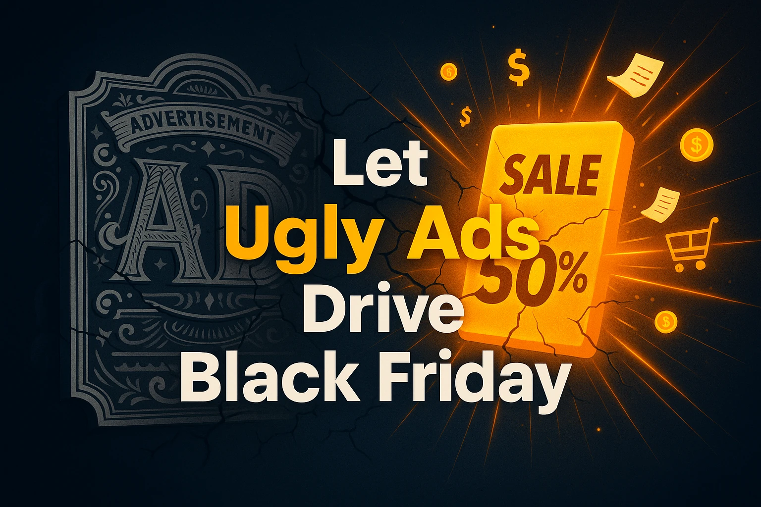
Why the Ugliest Black Friday Ads Outperform the Beautiful Ones
The counter-intuitive truth about what actually drives seasonal sales
Your design team just spent three weeks crafting the perfect Black Friday campaign. Gorgeous gradients, sophisticated animations, clever wordplay that made everyone in the conference room nod approvingly. The kind of work that wins creative awards.
Then you launch it alongside your competitors' campaigns, and something absolutely maddening happens. The ugliest ad in your feed, literally white text on a black background that looks like it was made in Microsoft Paint, crushes your conversion rate. We're talking 3x the performance of your masterpiece.
Every marketer has lived this nightmare. That moment when you stare at the data and think, "This can't be right. That ad is hideous."
But here's what I've learned after watching this pattern repeat across hundreds of campaigns: during Black Friday, clarity outperforms creativity every single time. And the data backs this up in ways that'll make you question everything you thought you knew about seasonal marketing.
The 3-Style Black Friday Creative Hierarchy
I know a guy named Fraser who runs an agency called Fragle. They've created over 10,000 ad creatives and managed more than $450 million in ad spend. When someone with that kind of firepower tells you something works, you listen.
Fraser showed me what he calls the "3-Style Black Friday Creative Hierarchy," and it completely flipped my understanding of seasonal marketing. The hierarchy works in ascending order of effectiveness, which means the simplest approach actually performs best. (I know, it sounds backwards.)
What do Black Friday shoppers actually want? They're not browsing for inspiration or discovering new brands. They already know what they want, they just want it cheaper. This fundamental shift in psychology explains why the ugliest ads win.
The first style is what Fraser calls "ludicrously simple statics." Picture this: black background, white text, maybe some bold highlighting on the discount percentage. That's it. No graphics, no product shots, no creative flourishes. Just "Human's Black Friday Sale is Here" in basic typography.
Fraser told me about a Humantra ad that looked exactly like this, so basic that most people would assume it was the worst-performing creative in the account. Instead, it was one of their top-performing static ads during Black Friday. The reason? People already shopping for supplements don't need to be convinced to buy supplements. They need to know there's a deal.
The second approach takes this simplicity but adds a personal touch through what Fraser calls the "founder letter format." Think of a heartfelt message from the company founder explaining why they're offering this rare discount, emphasizing their appreciation for customer loyalty. The key is making it scannable, bold the important parts, structure it for quick reading, but maintain that personal voice.
This works because it creates intimacy without sacrificing clarity. A founder saying "I rarely do this, but..." feels exclusive and genuine while still putting the offer front and center.
The third style might be the smartest lazy hack I've ever seen: "banner-over-evergreen." You take your highest-performing evergreen ads, the ones already proven to convert, and simply slap a "Black Friday Sale is Live" banner on top for about two seconds in the hook. That's it. No recreating, no new concept, no weeks of production.
Fraser used this exact method with Aloha, adding a simple graphic overlay to an existing video that was already crushing it. The result? Strong performance with about an hour of total work.
The Simple Truth About Implementation
Look, I get the resistance. Everything in your creative soul screams that this approach is too simple, too basic, too... ugly. But remember what Fraser said: "It seems too easy to be true, but it often really is that simple. A lot of the time I see brands overthink Black Friday."
Here's the practical reality: if you're going to test one thing this season, start with ludicrous simplicity. Create that black background, white text ad with your clearest offer statement. Make the discount percentage bold, keep the hierarchy scannable, and resist every urge to "improve" it with graphics.
For the founder letter approach, write like you're personally explaining to a friend why you're breaking your usual pricing rules. Bold the key elements, the discount, the timeline, the appreciation, but keep the conversational tone throughout.
And if you want the lowest-risk approach? Take your best-performing evergreen creative right now and add a simple Black Friday banner. Use CapCut or whatever basic editor you have access to. Two seconds of overlay graphics, then let your proven creative do the heavy lifting.
The brands that nail this understand something crucial: during Black Friday, customers aren't comparison shopping between brands, they're comparison shopping between offers from brands they already know. Your job isn't to be more creative than the competition. It's to be more clear about your deal.
The Bottom Line
Your elaborate Black Friday campaigns aren't just failing to drive results, they're actively working against your conversion rates. While you're perfecting animations and crafting clever headlines, your competitors are making more sales with ads that look like they were designed by someone's intern in five minutes.
The most expensive mistake you can make this season is overthinking Black Friday. Clarity beats creativity. Simple beats sophisticated. And sometimes the ugliest ad in your account becomes your biggest revenue driver.
The question isn't whether this approach works, the $450 million in managed spend proves it does. The question is whether you're willing to set aside your creative ego long enough to try it.